
Methane Emission Dashboard
Methane Emission Dashboard
A dashboard designed to monitor emissions across multiple sites, ensuring compliance with regulatory thresholds.
A dashboard designed to monitor emissions across multiple sites, ensuring compliance with regulatory thresholds.
OVERVIEW
A mining company wanted a comprehensive dashboard to monitor methane emissions from their sites and be in line with government mandates that stated that the organization is required to track emissions and achieve net zero by 2030.
A mining company wanted a comprehensive dashboard to monitor methane emissions from their sites and be in line with government mandates that stated that the organization is required to track emissions and achieve net zero by 2030.
The objective was to design an intuitive and interactive emissions monitoring platform for enabling stakeholders to track, forecast, and act on emissions data at both an executive and operational level.
The objective was to design an intuitive and interactive emissions monitoring platform for enabling stakeholders to track, forecast, and act on emissions data at both an executive and operational level.
Timeline
2 months
Team members
Lead UX designer (me); UX manager; Junior UI designer
My contribution
I led UX research & design, conducting stakeholder interviews, creating JTBD, defining the design and data visualization specs, wireframing and oversaw visual design and prototyping while mentoring the junior designer.
THE PROBLEM
Stakeholders need a fast and easy way to see emissions data and quickly take action when levels go over the limit, or they risk paying large fines.
Stakeholders need a fast and easy way to see emissions data and quickly take action when levels go over the limit, or they risk paying large fines.
IMPACT CREATED
Moving from scattered spreadsheet reports to the dashboard enabled the following
Moving from scattered spreadsheet reports to the dashboard enabled the following
Improved decision speed through data visualization
Translated dense emissions and compliance data into hierarchical, drill-down views, enabling faster identification of high-risk sites and intervention areas.
Connected emissions data to financial risk
Integrated net-zero targets with forecasted financial liabilities, shifting the tool from passive reporting to proactive performance management.
Increased operational visibility across sites
Unified multi-site emissions data into a centralized platform, enabling leadership and site managers to identify performance gaps and act on high-risk areas faster.
TARGET USERS
Through our stakeholder interviews we narrowed down to 2 primary user groups and created user persona
Through our stakeholder interviews we narrowed down to 2 primary user groups and created user persona

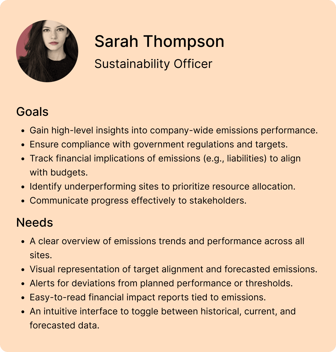
KEY DIFFERENCE
Site managers needed detailed operational views to make decisions while sustainability officers needed to oversee multiple sites to report high level data to C-suite.
Site managers needed detailed operational views to make decisions while sustainability officers needed to oversee multiple sites to report high level data to C-suite.
REQUIREMNTS
I conducted semi structured interviews to narrow down the requirements and set the scope of the project.
I conducted semi structured interviews to narrow down the requirements and set the scope of the project.

JOBS TO BE DONE
I used Jim Kalbach's Jobs To Be Done methodology to inform data visualization decisions as it pairs well with semantic interaction design.
I used Jim Kalbach's Jobs To Be Done methodology to inform data visualization decisions as it pairs well with semantic interaction design.


FINAL SOLUTION
Semantic, easy to scan, actionable executive and operational view dashboards to address both primary user types
Semantic, easy to scan, actionable executive and operational view dashboards to address both primary user types
The design used heavy data visualization techniques to ensure ease of consumption for technical and non technical users
EXECUTIVE HOME
Provides users with high level overview of all sites along with tracking data against targets with the ability to drill down into specific sites and incidents.
EXECUTIVE SITE VIEW
Provides a more granular site emission breakdown supporting the job to measure individual site liabilities, performance and understanding
SITE MANAGER VIEW
The dashboard provides a more detailed view for the site manager for a specific site, along with any incidents, action updates and detailed emission profile views to make informed decisions on processes.
ITERATIONS
This dashboard was the result of multiple iterations, finalized after testing wireframes and layouts with SMEs and stakeholders to ensure it fit their JTBDs.
These were some earlier iterations that were tested and reworked based on client feedback.
This dashboard was the result of multiple iterations, finalized after testing wireframes and layouts with SMEs and stakeholders to ensure it fit their JTBDs.
These were some earlier iterations that were tested and reworked based on client feedback.

LEARNINGS
This was my first project dealing with detailed data visualization. Using Stephen Few's work I was able to understand the art of dashboards and data viz.
This was my first project dealing with detailed data visualization. Using Stephen Few's work I was able to understand the art of dashboards and data viz.
Writing a data viz spec sheet
I created thorough documentation about the interaction design and data visualization specs used for the dashboard for the dev handoff to ensure consistency after delivery
Converting raw data into a story
I learned how a large amount of data can tell a story effectively when designed well using data visualization techniques.
Writing a data viz spec sheet
I created thorough documentation about the interaction design and data visualization specs used for the dashboard for the dev handoff to ensure consistency after delivery
Explore other projects


©2025 Tanay Arora.
Life is too short to eject USB safely
©2025 Tanay Arora.
Life is too short to eject USB safely
Design needs space to breathe.
Please view this on a desktop :)
Back